

Posted May 11th 2013, 8:42 am
Font:Planet Kosmos
Font Size:14- 15px
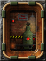
Blank Image:

Creation Type:


This ranks were made by me for other forumotion user :): ,
I saved the PSD and now I propose them , I hope you like this, :D:
~MostOne~
Font Size:14- 15px
Blank Image:
Creation Type:
This ranks were made by me for other forumotion user :): ,
I saved the PSD and now I propose them , I hope you like this, :D:
~MostOne~