Coding-Spot

You are not connected. Please login or register


How to use CSS3 Digital Clock with jQuery and Loading Animation Loop in forumotion?

Message (Page 1 of 1)

#1

weeknight

weeknight
 
Senior Member

Posted May 1st 2013, 8:15 pm

 
Can you help me, for this tutorial? :D:

I done try that tutorial, but i'm failed :(:

before i ask, can tutorial be used in forumotion??

if can, please help me :):

http://www.alessioatzeni.com/wp-content/tutorials/html-css/CSS3-loading-animation-loop/index.html
How to use CSS3 Digital Clock with jQuery and Loading Animation Loop in forumotion? SzgjVuk

and this

http://www.alessioatzeni.com/wp-content/tutorials/jquery/CSS3-digital-clock/index.html
How to use CSS3 Digital Clock with jQuery and Loading Animation Loop in forumotion? 39kyoOa

my forum:
http://astajim.indonesianforum.net/

please help me :)

thanks before :D:


#2

Mark

Mark
 
Administrator
Administrator

Posted May 1st 2013, 10:39 pm

 
Use this:
Code:
<style>
.stop {
   -webkit-animation-play-state: paused;
   -moz-animation-play-state: paused;
}

/* Loading Circle */
.ball {
   background-color: rgba(0,0,0,0);
   border:5px solid rgba(0,183,229,0.9);
   opacity:.9;
   border-top:5px solid rgba(0,0,0,0);
   border-left:5px solid rgba(0,0,0,0);
   border-radius:50px;
   box-shadow: 0 0 35px #2187e7;
   width:50px;
   height:50px;
   margin:0 auto;
   -moz-animation:spin .5s infinite linear;
   -webkit-animation:spin .5s infinite linear;
}

.ball1 {
   background-color: rgba(0,0,0,0);
   border:5px solid rgba(0,183,229,0.9);
   opacity:.9;
   border-top:5px solid rgba(0,0,0,0);
   border-left:5px solid rgba(0,0,0,0);
   border-radius:50px;
   box-shadow: 0 0 15px #2187e7;
   width:30px;
   height:30px;
   margin:0 auto;
   position:relative;
   top:-50px;
   -moz-animation:spinoff .5s infinite linear;
   -webkit-animation:spinoff .5s infinite linear;
}

@-moz-keyframes spin {
   0% { -moz-transform:rotate(0deg); }
   100% { -moz-transform:rotate(360deg); }
}
@-moz-keyframes spinoff {
   0% { -moz-transform:rotate(0deg); }
   100% { -moz-transform:rotate(-360deg); }
}
@-webkit-keyframes spin {
   0% { -webkit-transform:rotate(0deg); }
   100% { -webkit-transform:rotate(360deg); }
}
@-webkit-keyframes spinoff {
   0% { -webkit-transform:rotate(0deg); }
   100% { -webkit-transform:rotate(-360deg); }
}

/* Trigger button for javascript */

.trigger, .triggerFull, .triggerBar {
   background: #000000;
   background: -moz-linear-gradient(top, #161616 0%, #000000 100%);
   background: -webkit-linear-gradient(top, #161616 0%,#000000 100%);
   border-left:1px solid #111; border-top:1px solid #111; border-right:1px solid #333; border-bottom:1px solid #333;
   font-family: Verdana, Geneva, sans-serif;
   font-size: 0.8em;
   text-decoration: none;
   text-transform: lowercase;
   text-align: center;
   color: #fff;
   padding: 10px;
   border-radius: 3px;
   display: block;
   margin: 0 auto;
   width: 140px;
}
      
.trigger:hover, .triggerFull:hover, .triggerBar:hover {
   background: -moz-linear-gradient(top, #202020 0%, #161616 100%);
   background: -webkit-linear-gradient(top, #202020 0%, #161616 100%);
}

</style>

<div class="container">
<div class="content">
<div class="ball"></div>
<div class="ball1"></div>
</div>
</div>
<a class="trigger" href="javascript:void(0)">Play/Stop Animation</a>
Place them any where you want.

And for the clock, i made it as a tutorial since it is indeed cool also.
Here: https://coding-spot.darkbb.com/t126-css3-animated-clock

Enjoooooy! :):


https://coding-spot.darkbb.com


#3

weeknight

weeknight
 
Senior Member

Posted May 1st 2013, 11:52 pm

 
Hello mr.mark :D:

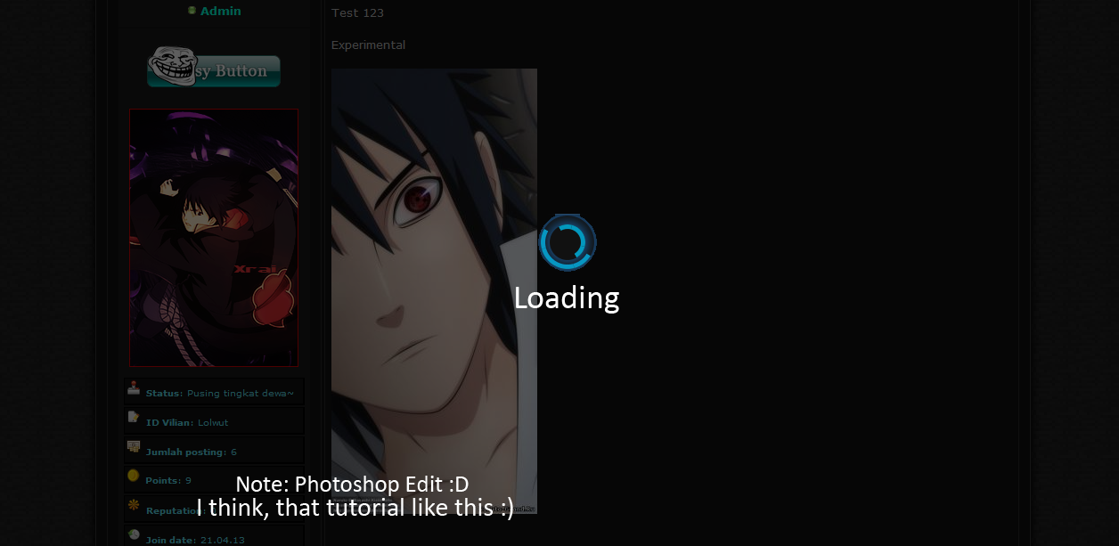
This code, placed where??
JS, css, HTML or other??
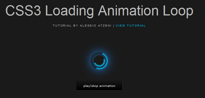
before i'm try in JS, but not out (loading animation) :):

Code:
    <style>
    .stop {
      -webkit-animation-play-state: paused;
      -moz-animation-play-state: paused;
    }

    /* Loading Circle */
    .ball {
      background-color: rgba(0,0,0,0);
      border:5px solid rgba(0,183,229,0.9);
      opacity:.9;
      border-top:5px solid rgba(0,0,0,0);
      border-left:5px solid rgba(0,0,0,0);
      border-radius:50px;
      box-shadow: 0 0 35px #2187e7;
      width:50px;
      height:50px;
      margin:0 auto;
      -moz-animation:spin .5s infinite linear;
      -webkit-animation:spin .5s infinite linear;
    }

    .ball1 {
      background-color: rgba(0,0,0,0);
      border:5px solid rgba(0,183,229,0.9);
      opacity:.9;
      border-top:5px solid rgba(0,0,0,0);
      border-left:5px solid rgba(0,0,0,0);
      border-radius:50px;
      box-shadow: 0 0 15px #2187e7;
      width:30px;
      height:30px;
      margin:0 auto;
      position:relative;
      top:-50px;
      -moz-animation:spinoff .5s infinite linear;
      -webkit-animation:spinoff .5s infinite linear;
    }

    @-moz-keyframes spin {
      0% { -moz-transform:rotate(0deg); }
      100% { -moz-transform:rotate(360deg); }
    }
    @-moz-keyframes spinoff {
      0% { -moz-transform:rotate(0deg); }
      100% { -moz-transform:rotate(-360deg); }
    }
    @-webkit-keyframes spin {
      0% { -webkit-transform:rotate(0deg); }
      100% { -webkit-transform:rotate(360deg); }
    }
    @-webkit-keyframes spinoff {
      0% { -webkit-transform:rotate(0deg); }
      100% { -webkit-transform:rotate(-360deg); }
    }

    /* Trigger button for javascript */

    .trigger, .triggerFull, .triggerBar {
      background: #000000;
      background: -moz-linear-gradient(top, #161616 0%, #000000 100%);
      background: -webkit-linear-gradient(top, #161616 0%,#000000 100%);
      border-left:1px solid #111; border-top:1px solid #111; border-right:1px solid #333; border-bottom:1px solid #333;
      font-family: Verdana, Geneva, sans-serif;
      font-size: 0.8em;
      text-decoration: none;
      text-transform: lowercase;
      text-align: center;
      color: #fff;
      padding: 10px;
      border-radius: 3px;
      display: block;
      margin: 0 auto;
      width: 140px;
    }
         
    .trigger:hover, .triggerFull:hover, .triggerBar:hover {
      background: -moz-linear-gradient(top, #202020 0%, #161616 100%);
      background: -webkit-linear-gradient(top, #202020 0%, #161616 100%);
    }

    </style>

    <div class="container">
    <div class="content">
    <div class="ball"></div>
    <div class="ball1"></div>
    </div>
    </div>
    <a class="trigger" href="javascript:void(0)">Play/Stop Animation</a>

thanks for help me again :D:


#4

Mark

Mark
 
Administrator
Administrator

Posted May 1st 2013, 11:58 pm

 
Put them on your homepage message or in any template you want. Depends on you.


https://coding-spot.darkbb.com


#5

weeknight

weeknight
 
Senior Member

Posted May 2nd 2013, 12:07 am

 
if like this?
http://astajim.indonesianforum.net/
How to use CSS3 Digital Clock with jQuery and Loading Animation Loop in forumotion? VnSkLxu

whether the tutorial is not loading like this? :):
How to use CSS3 Digital Clock with jQuery and Loading Animation Loop in forumotion? AGyG5Ny

thanks for reply my post mr.mark :D:


#6

Mark

Mark
 
Administrator
Administrator

Posted May 2nd 2013, 12:24 am

 
The tutorial you provided me is only a style of a loading. So i provided it to you :D:.


https://coding-spot.darkbb.com


#7

weeknight

weeknight
 
Senior Member

Posted May 2nd 2013, 12:34 am

 
hmm,
I previously thought,, that tutorial like this :D:
How to use CSS3 Digital Clock with jQuery and Loading Animation Loop in forumotion? 4TrBJu1
if it could be like that, wow amazing and very cool :D:

apparently only widget, placed in the homepage :)

heheh, lol :D

thanks for reply my post mr.mark

thanks before :D


#8

Mark

Mark
 
Administrator
Administrator

Posted May 2nd 2013, 1:02 am

 
Yep. The clock, you already check it?
So this is solved now? :D:


https://coding-spot.darkbb.com


#9

weeknight

weeknight
 
Senior Member

Posted May 2nd 2013, 11:37 am

 
yes, I already check mr.mark :D:

Problem solved. ;)

thanks for help me :D


#10

Mark

Mark
 
Administrator
Administrator

Posted May 2nd 2013, 2:00 pm

 
Since the problem is solved, i'll locked this and move to archive section. :D:
~ Locked and Moved


https://coding-spot.darkbb.com


#11

Sponsored content


Posted


Message (Page 1 of 1)

Permissions in this forum:
You cannot reply to topics in this forum

In total there is 0 user online :: 0 Registered, 0 Hidden and 0 Guests

Users browsing this forum: None